Although people use the proverb — “don’t judge a book by its cover” so often, they are always attracted to visually fascinating objects and products rather than emphasizing on the functionalities. Web contents today are more visual-centric than ever. More than 84% of the communication has been visual since 2018 as per the research.
There are web designers who are constantly pushing their creativity beyond the limit to create aesthetically satisfying websites and web pages, but they forget that websites are also built for search engines as well.
But will visually awesome websites help you to brand yourself in the digital world and help you prosper well in your business as well? No. A big no. Only by creating a visually astounding website won’t help you to stand on the podium in this digital era. Then what’s the point of creating a visually attractive website when it barely gets a view or a couple?
Although the visually fascinating websites might provide great user experience, only the graphics and animations won’t help your websites rank high in the search results. Your websites must be blended in such a way that they must have a great user experience and are easily crawled by the search engines so that they appear on the front page of the search results.
There are some web designing blunders which will have a dreadful effect on your website’s SEO. So, your graphic designer and SEO specialist should work together so that neither the graphics and user experience nor the search engine ranking of your website is compromised.
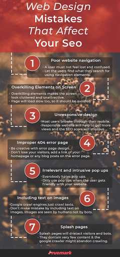
There are some common web design mistakes designers make on a regular basis when it comes to SEO. Here is a list of 7 web designing mistakes that affect your SEO and you should avoid them when you are building your website or even re-building your existing website.
Poor Website Navigation
Navigation is the focal part of a website which helps the user to find exactly what they are looking for. Better navigation helps the user to lead themselves to the most informative section on a website and that is how a user expects the website to be.
A website and it’s contents should be properly organized. A website with poor navigation can never be user-friendly. A visitor won’t dwell on the animations and the flashy color of a website all the time, rather he/she should be clear where he/she is and where he/she wants to be. If a visitor is not clear about the navigation and content of your website then he/she will go back to the search results and pick another website.
So, you must set up your website in such a way that a visitor should be able to find anything on the website with absolute ease. Properly organized content and easy to understand navigation won’t only satisfy your visitors but will also secure good marks in SEO. The user should not feel lost while using your website. So, you should set a global navigation bar on every web page.

There are numerous navigation techniques that can be implemented on a website. It all depends on your needs and your customers' needs whether to implement a horizontal navigation menu or a vertical navigation menu or mega drop-down menu or sticky/fixed menu or any kind of navigation menu.
Also, you should include footer elements on your website. They are very important SEO elements which will help your website rank higher too.
A shortlist of must-have footer elements are listed below:
- Contact Information
- Main Services and Products
- Call to Action (CTA)
- Privacy Policy and Terms of Use
- Latest Articles
- Social Media Widgets
Another integral navigation element is Breadcrumb navigation. A Breadcrumb or Breadcrumb trail is a secondary navigation scheme that shows the user’s location on a website by exhibiting their trail up to that particular page on that website. It lets the users know their current location on the website and how they got there.
Like Hansel and Gretel threw breadcrumbs to mark their trail into the woods in the fairy tale, you also need to check the breadcrumbs on the website if you feel lost.

Even Apple have used breadcrumbs in their website, but in a unique way, at the bottom of their website.

Overkilling Elements on the Screen
The first look of all those fancy animation and graphics on a website might look very attractive, but if you need to use similar websites with extreme graphical contents very frequently then you wouldn’t be happy to use them.
Maximum animation means maximum loading time. Also, the clutter of elements on a website will result in loading the page very slow. The world is now a place where a single second counts.
And because of all those extreme animations, graphics, redundant codes, unnecessary widgets, and many other elements, the page will load very slow. Nobody likes to use a tortoise-slow website. Unoptimized images, unclean code, javascript issues, and too many ads won’t let a website open in a flash.
A minimalist design is loved by all and of course, it won’t saturate your screens either. So why not use the optimal design for your website?
Page load time is a very important factor that affects the SEO of a website. Page load time is the total time a user has to wait until the page is completely loaded. In 2010, Google announced that page speed would make an impact on the ranking of a website. So, you should optimize all the elements on your website so that the website loads very fast.
On average, the page load time for a website should be less than 3 seconds. Study shows that 1 out of 2 people expect a page to load in less than 2 seconds. So, to get a good SEO score and to rank high in the search engine, one should not overkill the website with unnecessary elements so that a page loads faster.
Unresponsive Design
52.2% of all website traffic is generated from mobile and the percentage is growing. So, if you have not yet made a responsive website then you should hurry and call a web designer.
You don’t even need to call a web designer in fact, we can help you with responsive web design.
The responsive design detects the visitor's screen size and orientation and changes the layout accordingly. Mobile internet traffic is a hot thing right now because you can get a good number of visitors from your mobile compatible website, and it will lead to a better SEO score of your website.
Google is constantly changing and modifying its algorithm and they are being mobile-centric. Google has moved to a mobile-first index. Mobile-first indexing means that Google uses the mobile version of the content for indexing and ranking.
Suppose a visitor tries to visit a non-responsive website using his/her mobile, then he/she is sure to never return to the website again.
But on the other hand, a mobile-friendly website can result in more engagement of users on the website. Also, it will help in the reduction of the bounce rates too. Simply, we should understand one thing that almost everyone is using smartphones today, so, if you make your website smartphone-friendly, then there will be more users on your website. And if a user finds a website very friendly, then it is sure that that user will visit the site again and again.
Improper 404 Error Page
A designer always tries to be creative while designing an error page. Often it is found that error pages have a bit of humor with the use of funny quotes, images, and illustrations. Well, it is an important thing to attract a visitor’s eye by doing so, but the more important part is that you should at least add a link which will lead the user back to the website.
If you don’t include any links on the error page, the search engine will identify it as a broken internal link and it will have a negative effect on your SEO. The sole purpose of the error page is to let the user know that that particular page is unavailable at the moment and redirect him/her back to your site along with the help of a link.
You can be more creative while designing an error page. You can even include links to the most recent articles. It's all about your creativity and what you can do to again bring the visitors back to your website.
The following image is an example of a very creative error page design.
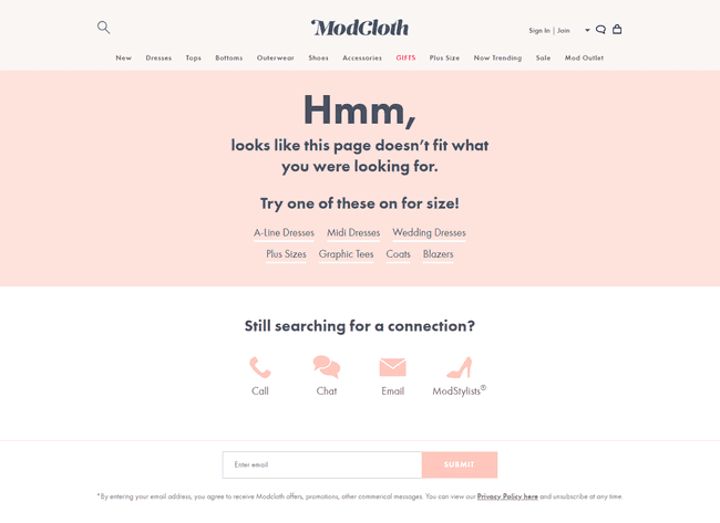
It's up to you whether you want to design an error page something like the above one but you must design one something like the below.

Just make sure that you don’t design an error page something like the error page shown below:
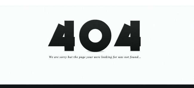
You can even make better sales from the error pages by giving offers to the visitors like shown below:

Don’t create confusion on the first-time or regular visitors, engage them instead and make them happy, this is how a brand is made. And a creative error page can do much more than you think.
Irrelevant and Intrusive Pop-ups
Don’t scare your visitors with the annoying pop-ups. Pop-ups are closed as soon as they pop up. First thing is that the visitors find them very annoying and secondly, the search engines do not index them as a part of the website. Both cases won’t lead to improvement in the SEO score. So, why make the irrelevant use of them?
There are some dreadful facts about entry pop-ups as per the users.
- Entry pop-ups are extremely disturbing.
- They prevent visitors from getting to the content they want.
- They disrupt the browsing and reading flow.
- They confuse visitors.
- Visitors don’t generally find the pop-up content relevant.
Google has created webmaster guidelines to discourage the use of traditional and irrelevant pop-ups. And Google has also cleared that using them can impact the search results too.
Instead of disturbing the users with pop-ups as soon as they land on your website, give them some time so that they get friendly with your website. Only show the pop-ups when they are ready for some secondary messages.
Here are some guidelines for you to make your pop-ups more relevant and user-friendly:
-
Display the Pop-ups After X Second
It takes some time for a visitor to get friendly with your website. So, analyze the appropriate time a user takes to get friendly with your website. You can display the pop-ups after that ‘x’ time. Also, you can display the pop-ups detecting the user’s inactivity.
-
Display the Pop-ups After the Visitor Visits X Percentage of Your Website
This is the best way to ensure that the visitor is ready for new content. You can display a pop-up after a visitor just finishes the last paragraph of your blog. The visitor will be ready for new content after he/she finishes reading one article/blog.
-
By implementing Exit-intent Pop-ups
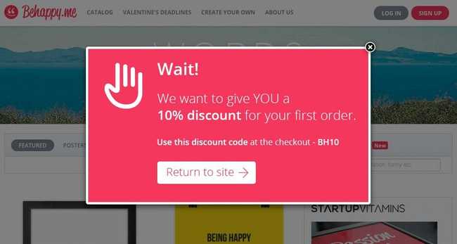
Exit-intent pop-up is a smart method of displaying pop-ups when a visitor is about to abandon your website. You can again get that visitor back on the page using the exit-intent pop-up method. You can transform the abandoning visitor into a paying customer. The ‘Exit Intent Technology’ can track and monitor the mouse clicks and the movement of the visitors.
One good example of the implementation of exit-intent pop-up is shown below:
Including Text on Images
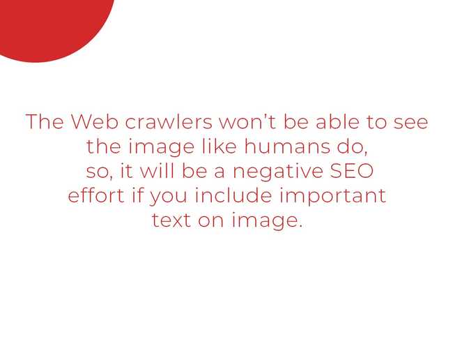
Search engine spiders crawl media content by looking for keywords and texts. The spiders on search engine programs only do two things — one thing is that they read the HTML code and another thing is that they search for text. The search engine always categorizes pages by text and not by images. So, all you need to know is that you must make your website rich with text content.
If your website is full of animation, graphics, and javascript, your website won’t rank high on Google. No matter if visitors like animation and graphic content, the search engine spiders will crawl for texts only. So, your priority is content in texts as text content is always the king.
You should consider not making the same mistakes again onwards. So, you must not include text on images.
You can use the alt text to provide a few descriptions about the image. Although the search engine can not read images, you can make them easy to understand about the image content there. This will help you rank higher in the search engines. Don't use generic image names like IMG00734. Use a descriptive image name that best defines the image, an example can be seo_techniques.jpg.
So, you should learn image optimization techniques so that your website can rank higher in the search engine.
Splash Pages
Splash pages are very common these days but they might have a negative impact on the SEO of your website.
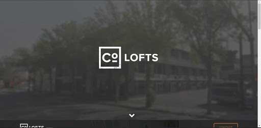
A splash page is a section that a user sees before he/she gets the option to continue to the main section of the website. The splash page is not a landing page but it appears at first and is used to promote the company, service, or product.
The homepage of a website is the most important page of a website as it holds more links than the rest of the pages. Holding maximum links means having more authority. The visitors can get to any section of the website by clicking on the links provided there.
While the splash page will kind of replace the homepage as all the external links will bring a visitor to this page. And the splash page has very few text or no text at all. While google spider crawls, it will get into the splash page from the external link. Since the spiders will see very few texts, they will abandon without crawling the whole website.
This will lead to a major catastrophe on the SEO of the website. So, splash pages should be used with precautions.
An example of a website using a splash page is shown below:
Your web designer, web developer, and SEO strategist must all get together and work to create a website that will be a design masterpiece as well as SEO friendly. If done so, the visitors on your website will have a very good user experience and their engagement will be remarkably well. If you are thinking of relaunching your website, you must focus on the search traffic and engagement level as well.
Only by avoiding the mistakes mentioned above, you will be able to have a good SEO score for your website.
If you have any suggestions regarding the article or want to work with us, please feel free to contact us.
